Date
Initial Branding - Aug 2021 to Oct 2021
Re-Branding - June 2023
New Website - Sept 2023 to Nov 2023
Contributors
Meet Chaudhari - Designer
Nikhil Sharma - CEO of DigiBenders
Brand Overview
Introducing DigiBenders, a digital agency where dedication meets creativity. Unlike others, we go beyond expertise by delivering results that bring your vision to life with a unique, innovative touch. At DigiBenders, we blend professionalism with originality, ensuring digital solutions that stand out. Experience a seamless journey where technology and creativity come together to make an impact.
Task Requirement
DigiBenders recognized that a compelling branding strategy was essential to communicate its core values, professionalism, and unique edge. Here’s why it mattered:
- Trust and Recognition: A strong brand builds trust and visibility, reflecting DigiBenders' professionalism and reliability in a competitive market.
- Consistency and Client Attraction: Consistent messaging attracts quality clients, reinforcing the agency’s reputation for innovation.
- Competitive Edge and Market Expansion: A distinct brand positions DigiBenders as a leader, opening doors for market expansion.
- Long-Term Success: A solid brand identity fosters client loyalty, supporting sustainable growth and lasting success.
Target Market
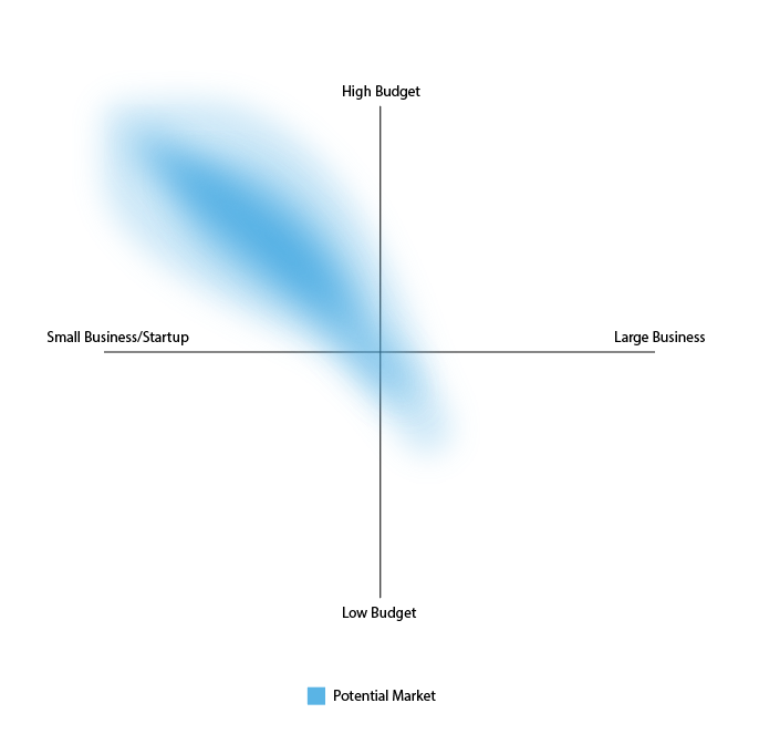
DigiBenders specializes in software development, branding, and digital marketing for Canadian businesses. Our ideal clients are small to mid-sized companies with mid to high budgets, looking for high-quality digital solutions within their financial range. We see rising demand in Canada for software that boosts productivity and enhances sales, as well as strong needs in branding and digital marketing. Small businesses, which form the backbone of Canada’s economy, often struggle with building a standout brand and effective online presence. DigiBenders aims to empower these businesses with tailored services that drive growth and connect with audiences online.
Target Audiences
We identified our target audience through careful research, analyzing demographics, needs, and challenges within the digital agency and software development fields. By studying clients, competitors, and gathering feedback, we gained insights into what drives satisfaction and engagement. This approach helped shape our brand for three main groups:
- SMBs, Startups or individuals: Small to medium businesses, startups, and individuals seeking digital solutions and branding for online growth.
- B2B: Businesses looking for software development, marketing, or branding to enhance their offerings and customer connections.
- E-commerce and Local Businesses: Online retailers and local companies aiming to increase digital visibility and engagement.
Our brand elements—such as logos, colors, and messaging—should be crafted to resonate with people passionate about tech, design, and modern software. We aim to create a brand that makes our audience feel understood, attracting those who share our values in technology and design.
Mood board
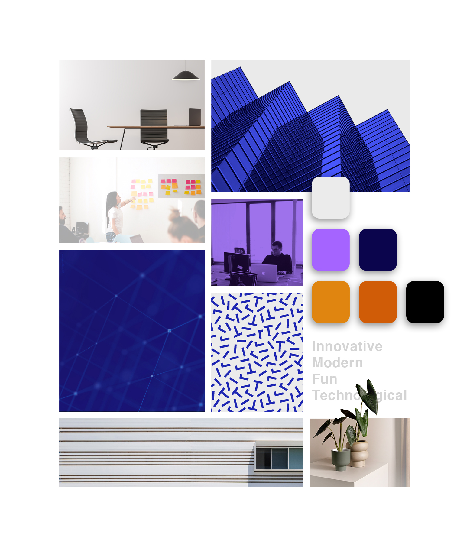
Nikhil and I led the project with a thoughtful approach, taking the time to explore all creative options. We built a mood board of images, colors, textures, and patterns that embodied DigiBenders’ spirit—innovative, modern, technical, and fun. This visual guide shaped our choices on colors, fonts, and imagery, aligning the brand’s aesthetic and tone. Acting as our creative compass, the mood board ensured that each design decision conveyed the brand’s unique essence across all digital platforms.
Colors
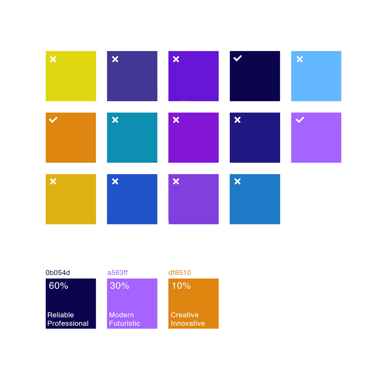
We started by gathering a wide range of colors that aligned with our brand’s essence. Then, through a careful process, we narrowed down hues, focusing on those that best resonated with our target audience and brand attributes. Colors that didn’t fit were eliminated, with an emphasis on selecting contrasting combinations that enhanced our identity. Finally, we chose three core colors, each representing our values and forming a balanced palette for our website, applied in a 60-30-10 ratio.
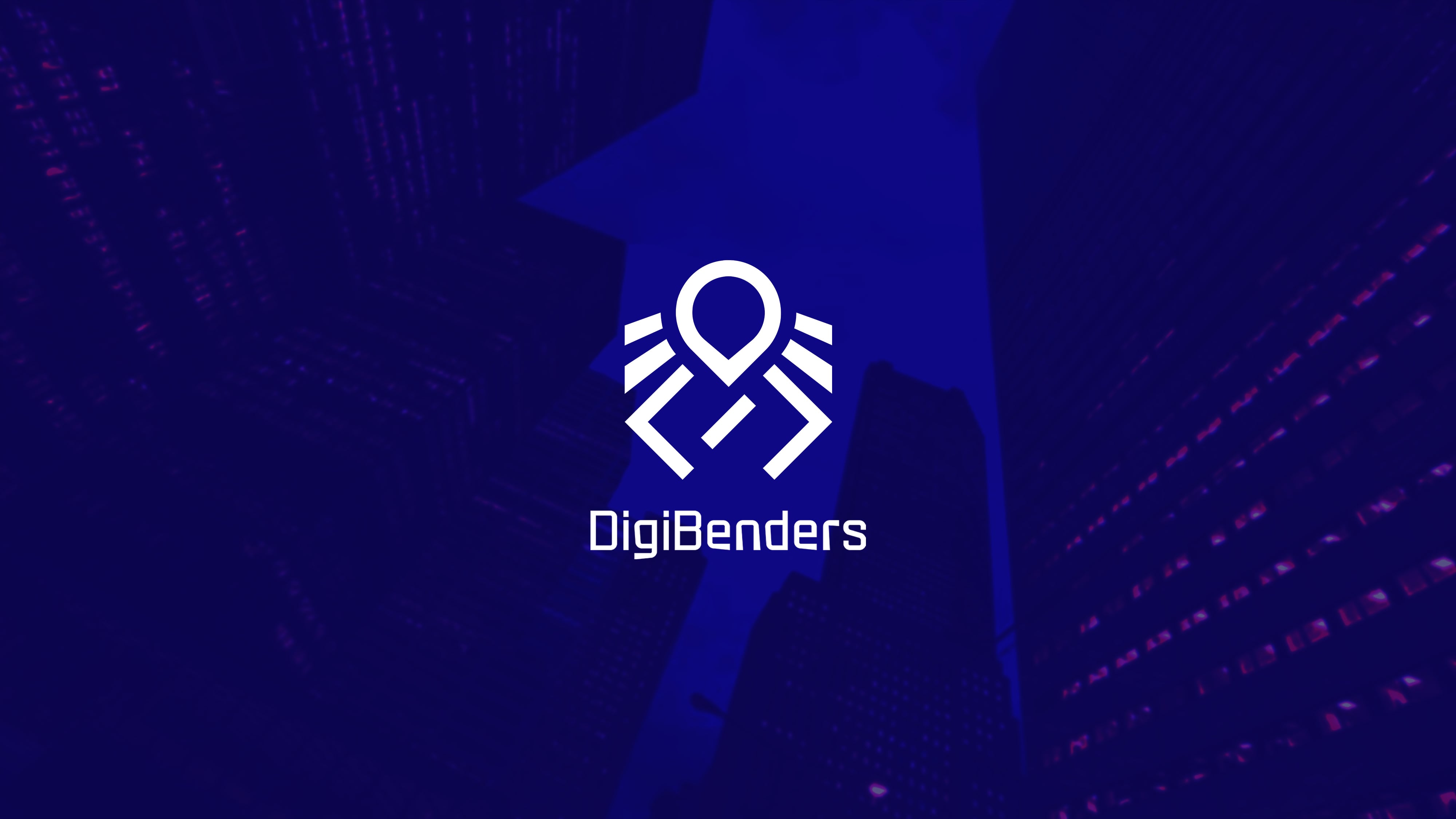
Logo
The logo is a crucial element of our visual identity, serving as an identifier rather than an explainer. We began by brainstorming simple icons that reflect attributes like coding, modernity, fun, software development, multitasking, and intelligence. Our goal was to design a memorable, scalable, and balanced shape that subtly hints at our company’s function, if possible. This approach led to an identity mark that, while not directly descriptive, embodies our brand’s essence, creating a symbol that is both recognizable and evocative.

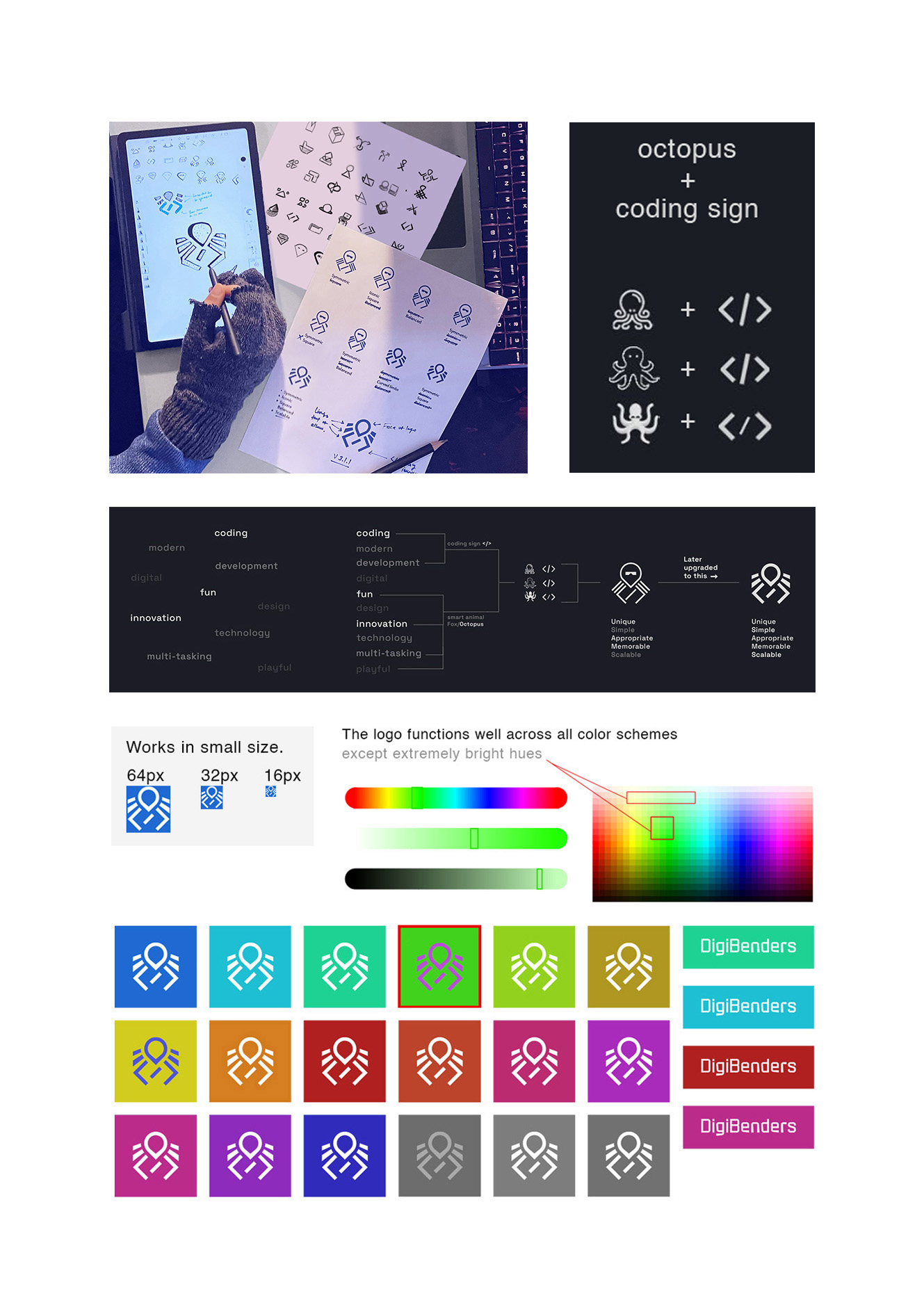
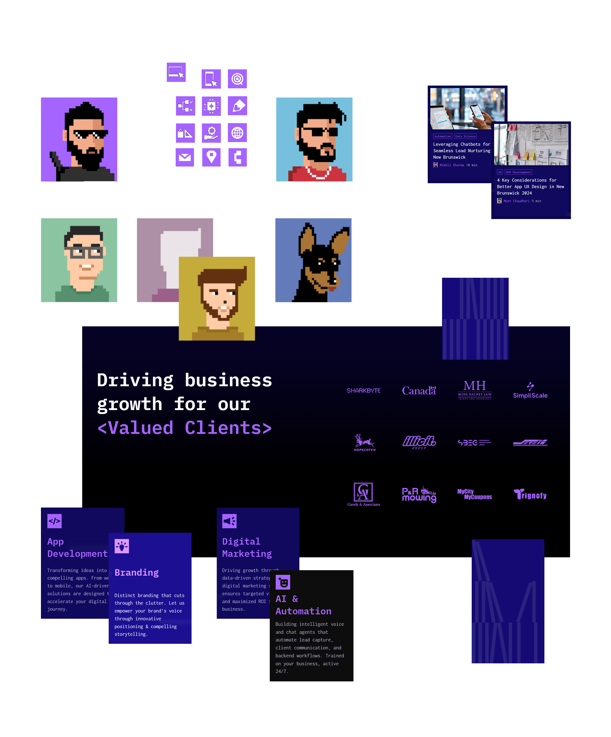
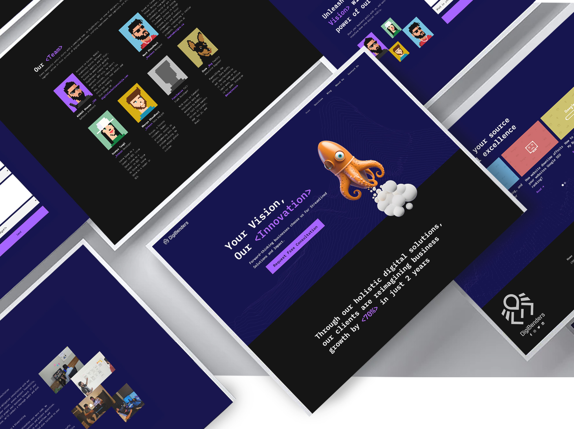
The octopus, known for its intelligence, represents multitasking, symbolized by its many limbs. Though not literal, this visual idea captures the essence of handling various tasks with ease. We aimed for a straightforward depiction of the octopus, enhanced with a futuristic, tech-inspired aesthetic to communicate both its intelligence and adaptability, creating a friendly and relatable symbol.
We designed an octopus-shaped graphic element with a cleverly hidden coding sign, </>, subtly incorporated within its form. The minimalist approach ensures scalability and symmetry, with balanced whitespace that maintains visual harmony. This refined graphic serves as a versatile and recognizable mark, aligning with the brand’s emphasis on adaptability and technical prowess.
The "DIGIBENDERS" text was custom-designed for readability, steering away from a corporate or mundane style. Our goal was to create a look that is both distinct and engaging, avoiding any overly formal impression, and supporting a brand identity that feels approachable yet innovative.
Typefaces
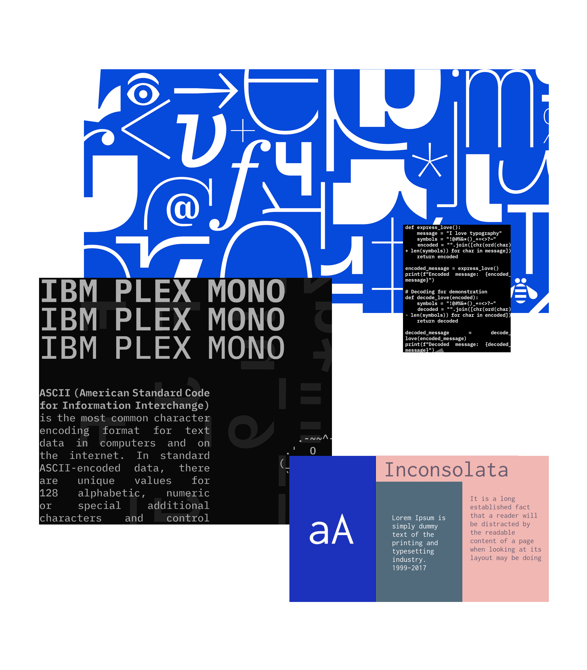
For this brand, the ideal typeface needed to balance modernity and approachability. We sought a slightly unique, easy-to-read sans-serif font that conveyed a clean, contemporary look, fitting our tech-focused identity. Prioritizing legibility, we chose a font that remains clear across sizes and mediums, with subtle stylization to add character while keeping a professional and recognizable appearance across both digital and print formats.
For headings, we selected IBM Plex Mono, which mirrors interface fonts used in coding software, lending a tech-savvy feel. For body text, we chose Inconsolata; visually similar to IBM Plex, it offers simpler kerning, improving readability for extended content.
Prototyping
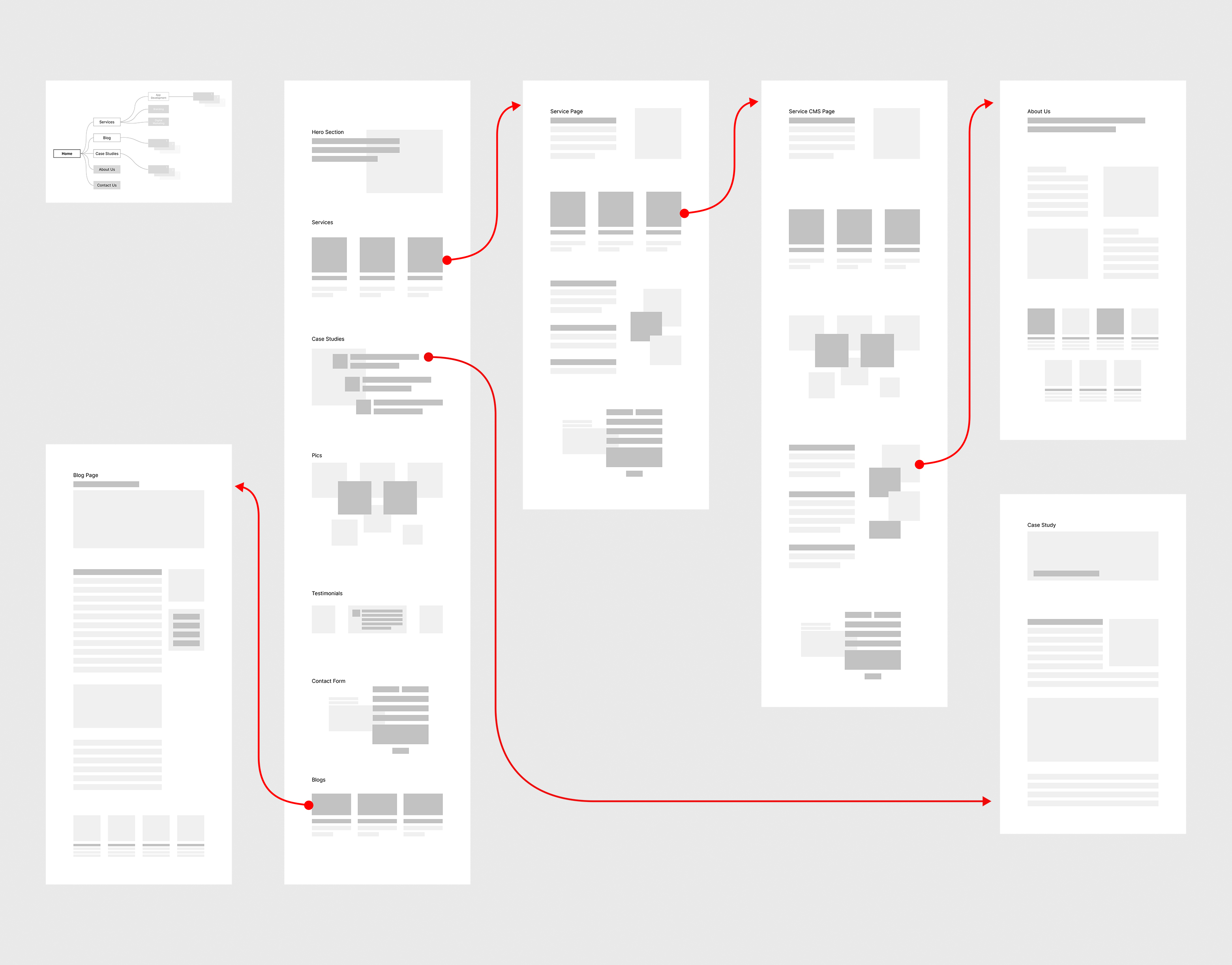
The DigiBenders website is a core asset, showcasing our dedication to fulfilling digital needs. Building its components from scratch allowed us to align each element with our high service standards. We crafted icons, illustrations, buttons, and a cohesive color scheme to achieve a modern, forward-thinking design that reflects our brand’s values.
Starting with wireframes, we structured essential pages like Home, About, Contact, Services, and Blog, ensuring intuitive navigation. The homepage prominently highlights our services, with links to detailed service pages for clarity. Functional images and client testimonials enhance user engagement, making the experience both informative and visually appealing.
Visit Website

Visual Elements
Eye-catching 3D graphics featuring an octopus were designed for key sections, while minimalist crypto-punk style pixel icons served as unique team portraits. To capture a modern and tech-driven feel, we incorporated geometric patterns and experimented with abstract, circuitry-inspired shapes that embody DigiBenders’ tech-focused essence. A cohesive color palette brought these elements together, creating dynamic backgrounds that evoke movement and energy while maintaining a sleek, contemporary look.
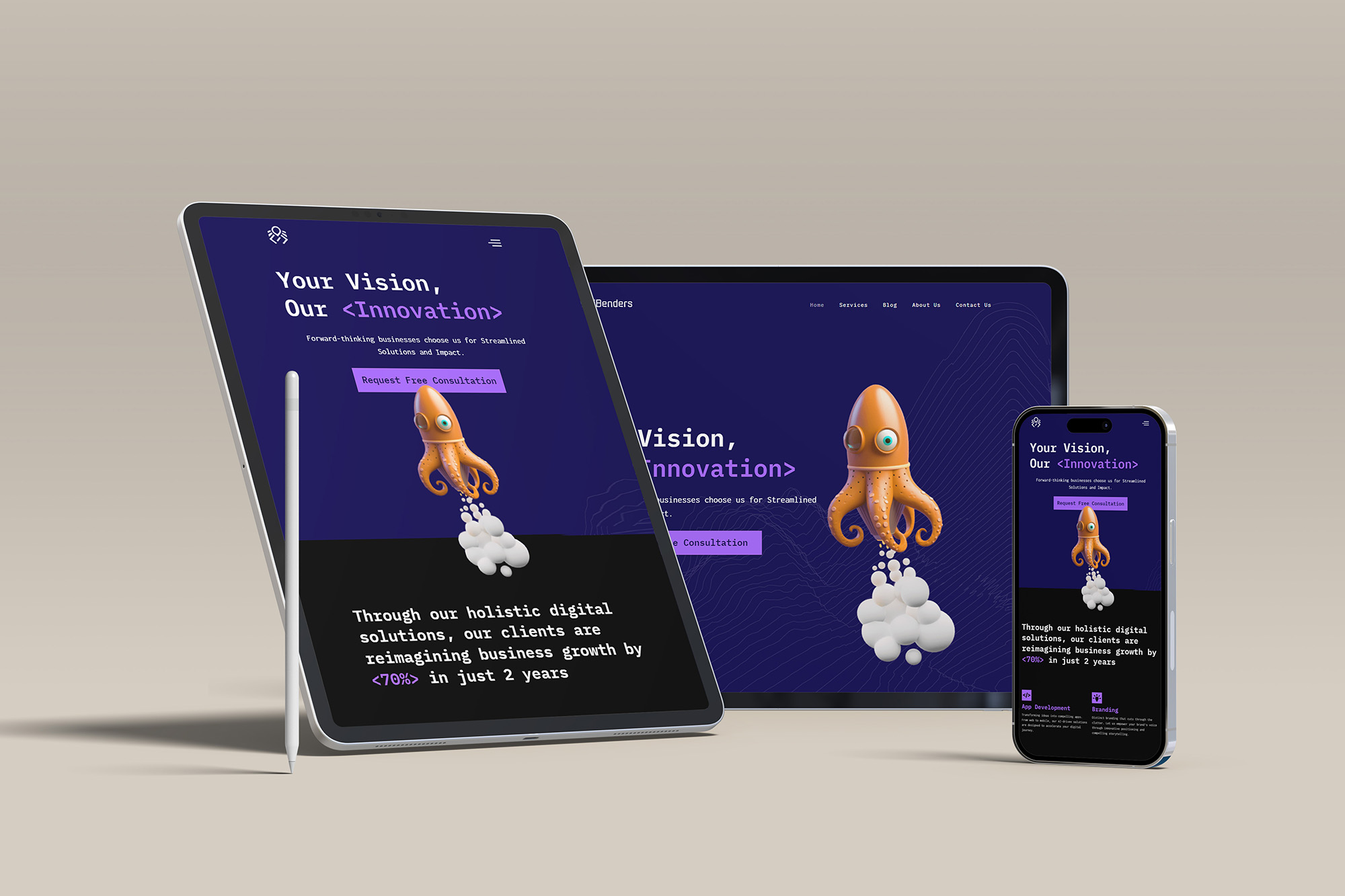
For the web layout, we emphasized adaptable spacing to ensure a seamless experience across mobile, tablet, and desktop devices. Consistent visual hierarchy was maintained, making elements accessible and navigable on all screen sizes. On mobile, we prioritized vertical spacing and compact, readable content; tablets allowed for a balanced view with ample room for interaction, while desktops featured more spacious layouts to enhance readability and visual appeal, delivering an optimized experience on every device.
Voice of the Brand
Our brand voice embodies a tech-savvy, approachable, and innovative tone. We aim for a conversational yet professional style, presenting our expertise without excessive formality. Our focus is on clear, straightforward communication, combining a modern touch with creativity. This friendly, relatable approach highlights our knowledge while making it accessible to a wide audience, ensuring everyone feels welcome and informed.
Website
The site features a bold purple and white color scheme, enhanced by playful octopus graphics that convey creativity and innovation. With a modern, well-structured layout and clear sans-serif typography, the design ensures a straightforward user experience.
Targeting an audience aged 18 to 50 in the United States and Canada, the design balances professionalism with a hint of whimsy. It appeals to younger adults who appreciate creativity, while also resonating with older professionals who value clarity and efficiency. Real-life images and client growth statistics add a practical touch, making the site engaging for a broad range of users.
Visit Website
Mockups
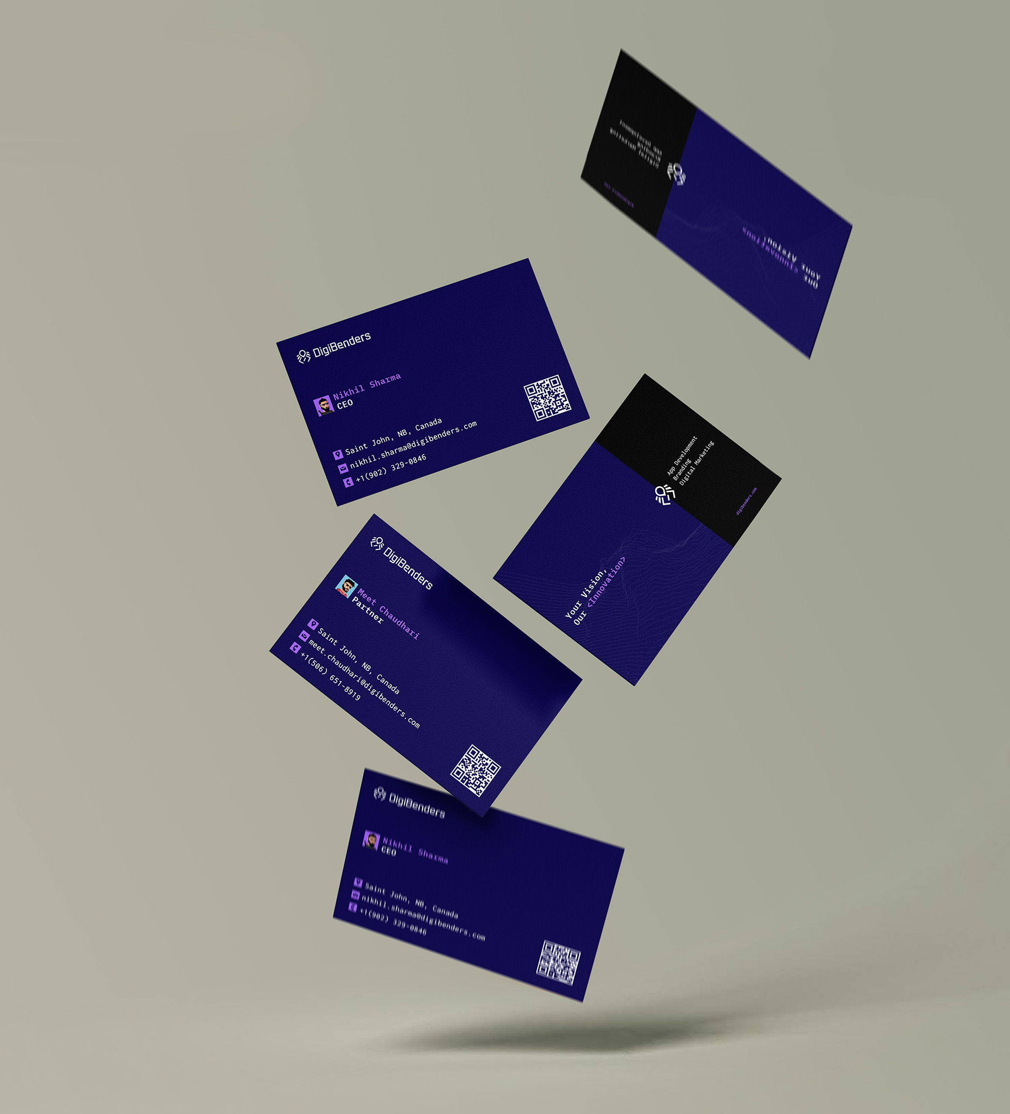
Testing logos and colors on various brand assets is crucial for ensuring consistency and impact across all platforms. This process confirms that design elements retain visibility, legibility, and emotional appeal across digital screens, print, and merchandise. Such careful evaluation prevents costly adjustments post-launch, ensures cultural relevance, and positions the brand distinctively against competitors.
By assessing how design choices function across different touchpoints, businesses strengthen their brand identity, making it versatile and universally resonant. This proactive approach helps establish a cohesive and memorable brand presence that stands out in any context.