Brand Overview
HHM stands for Hamlin, Hamlin & McGill. It is an imaginary legal firm that appears in the television show "better call saul." Chuck McGill and George M. Hamlin are credited with its inception; Chuck McGill served as a mentor to George's son Howard Hamlin while he prepared for and passed the bar exam and later joined the business. The three of them collaborated to make the company into one of the most successful in the city. Hamlin Sr. eventually passed away, and McGill eventually retired from his professional life, thus now Hamlin Jr. is the sole co-founder still serving on the board.
The HHM law firm is one of the largest legal practices in existence today. They go for higher price than everyone else. Their typical clients are either corporations operating on a medium to big scale, wealthy individuals, organizations, or communities, or high-profile individuals.
Task requirement
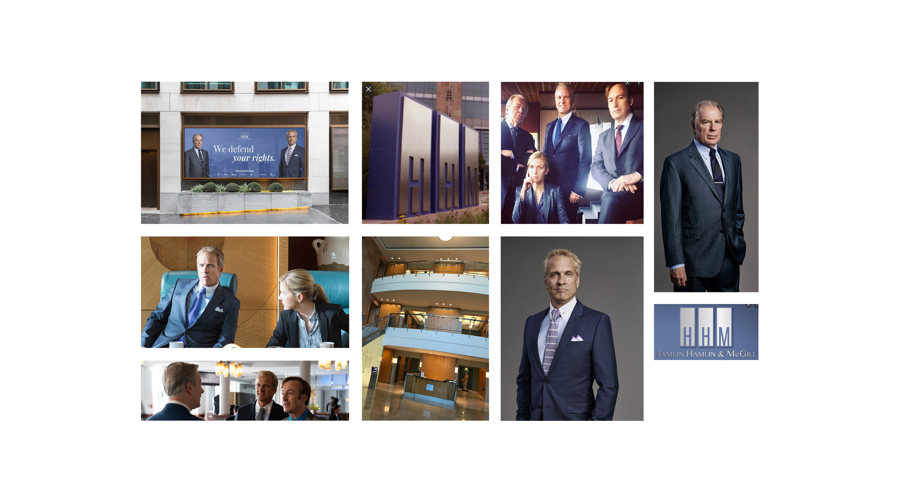
The logo shown in TV series for HHM is professional and easy to understand. I like it. Having said that, I do think there is opportunity for some improvement in it. The fact that it is straightforward appeals to a wide variety of customers, which is not precisely in keeping with the brand strategy of the company since their prices are not affordable for customers in the lower or middle classes. Another point is that their company is known for targeting mostly B2B meaning they mostly deal with large customers and their services are costly e.g.. Construction businesses, old aged houses etc. They are providing services of the highest quality and has an incredibly high success rate, however this is not accurately represented in their existing logo. Perhaps they were fresh to the market when they had their visual brand identity developed.
Logo
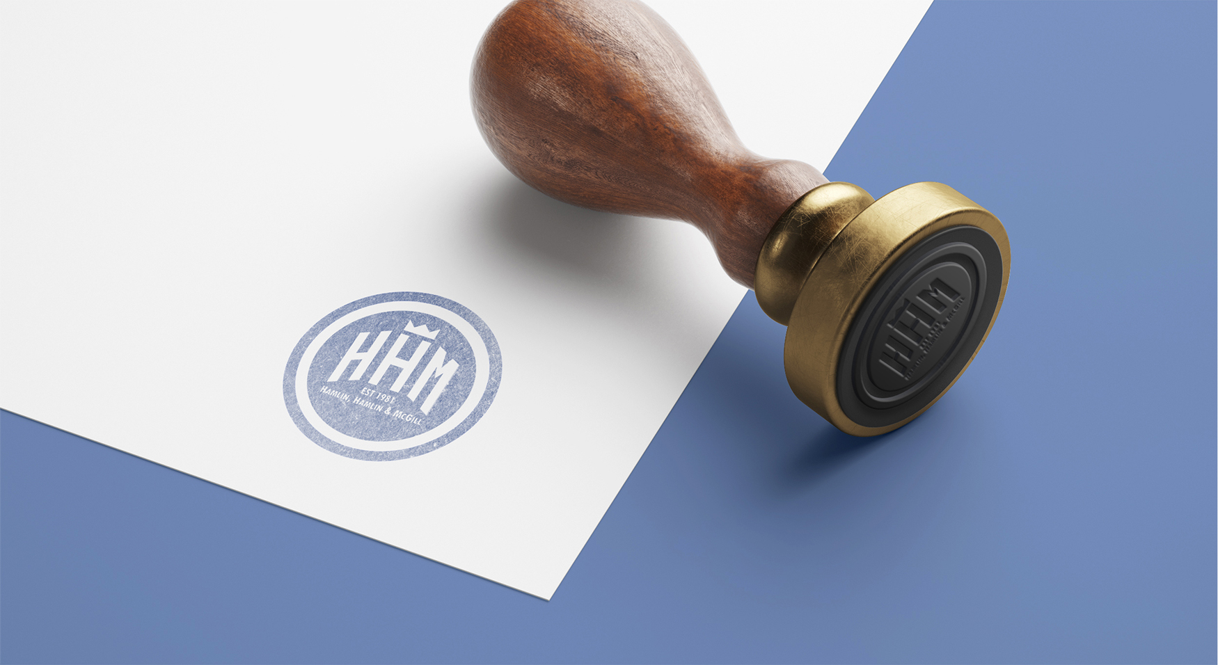
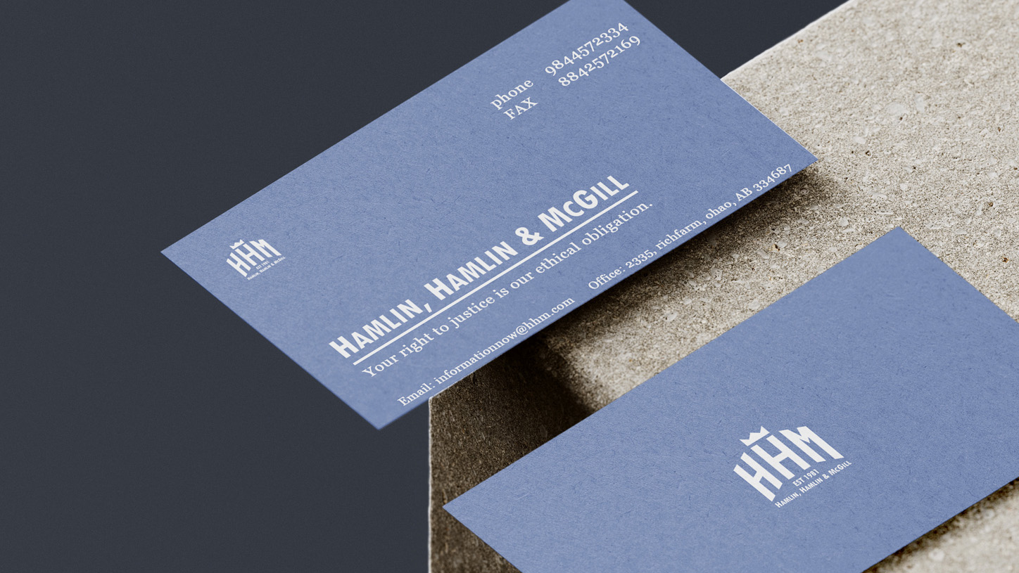
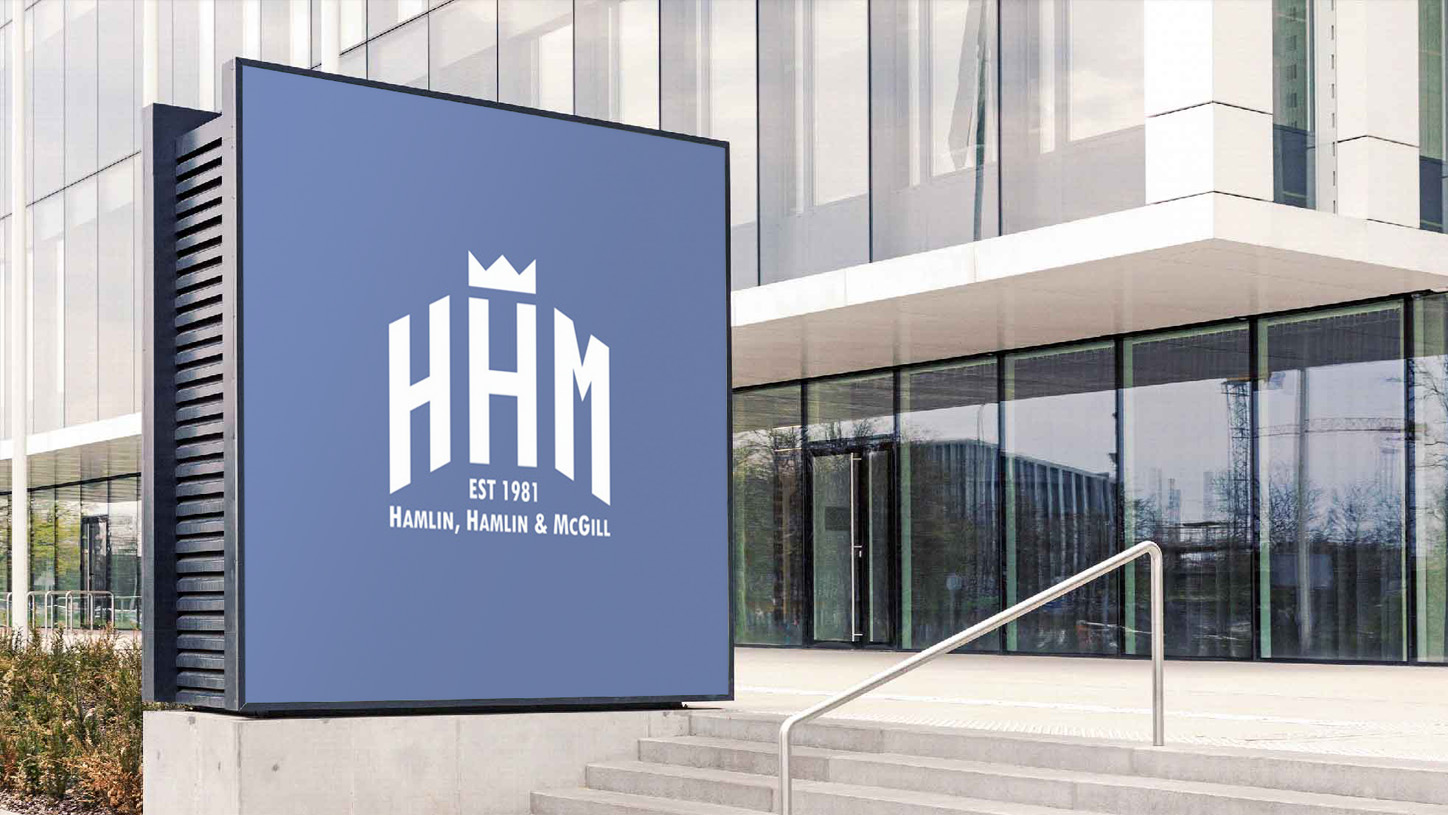
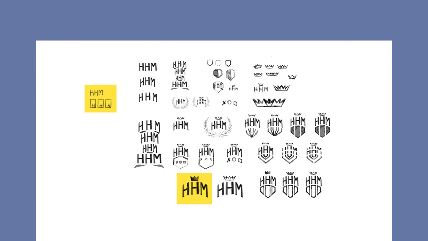
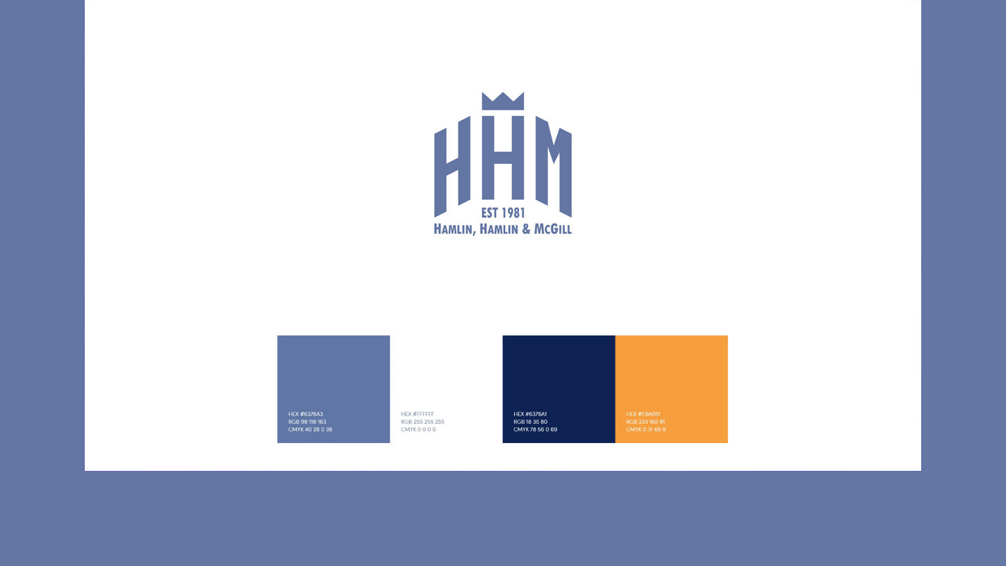
The redesigned HHM logo is one that isn't afraid to get right to the point and represents a lot. The logo makes use of towering fonts, which exude an air of confidence, It alludes to three confident founding members standing tall. The straight and angular lines stand for the firmness and openness of the business, while the thickness of the fonts and the crown represent the company's strength and highest success rate among their competition.

Colors
I believe that the color scheme that was selected by the show's creators for this one fits in very well with the company's overall vision, So, It's been kept as it is. White and a bluish-gray hue make up the primary color scheme. They are known for their informative and truthful nature, as well as their transparency.
Fonts
I have used serif fonts here. Due to their traditional appearance, serif fonts evoke sentiments of trust and esteem, making them ideal for corporate identities that emphasize authority and majesty. Serif typefaces, here Georgia regular style, are appropriate for "formal" contexts.

