Brand Overview
Linkroo is a modern SaaS product built to serve entrepreneurs, creators, and personal brands who want to grow on LinkedIn without the daily content grind. By combining AI-powered content generation, scheduling, and analytics into one cohesive platform, Linkroo helps users maintain a consistent presence with minimal effort. Backed by cutting-edge technology and a clean, creator-friendly design, the platform strikes a balance between professionalism and playfulness. From early traction through organic reels and carousels, the brand has built a loyal user base of early adopters and growth-minded professionals.
Task requirement
In a space crowded with generic content tools and automation hacks, Linkroo needed a distinct brand identity that clearly communicated its value: effortless, authentic LinkedIn growth. The goal was to create a visual system that felt sharp yet human, appealing to tech-savvy creators without overwhelming them. The brand identity had to reflect clarity, consistency, and confidence, ensuring users instantly felt aligned with the product’s mission. Every design element, from the logo to color palette and UI motifs, was crafted to position Linkroo as a trustworthy assistant in the journey of personal brand building.
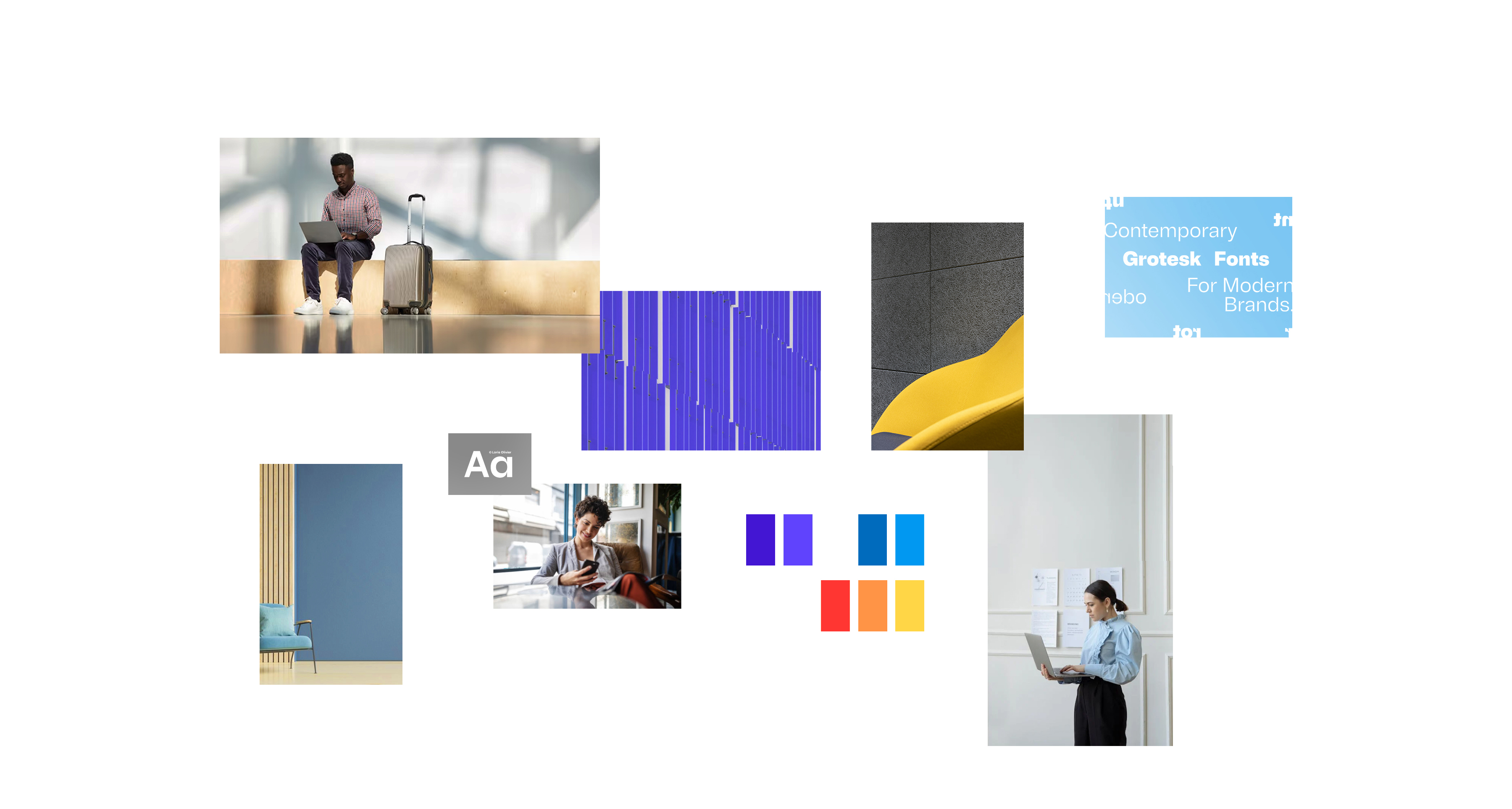
Mood board
To establish a clear creative direction for Linkroo, I curated a visual mood board that blends modern professionalism with a touch of playful energy. The selected imagery and elements reflect the dual nature of the brand, streamlined for productivity, yet approachable and creator-friendly. From bold blocks of color to sleek sans-serif typography, every element was chosen to evoke clarity, structure, and forward momentum. References include tech startup environments, contemporary fonts, and imagery showcasing digital workspaces. Together, these assets form the foundation for a design language that feels both empowering and effortlessly stylish, much like the product experience Linkroo aims to deliver.
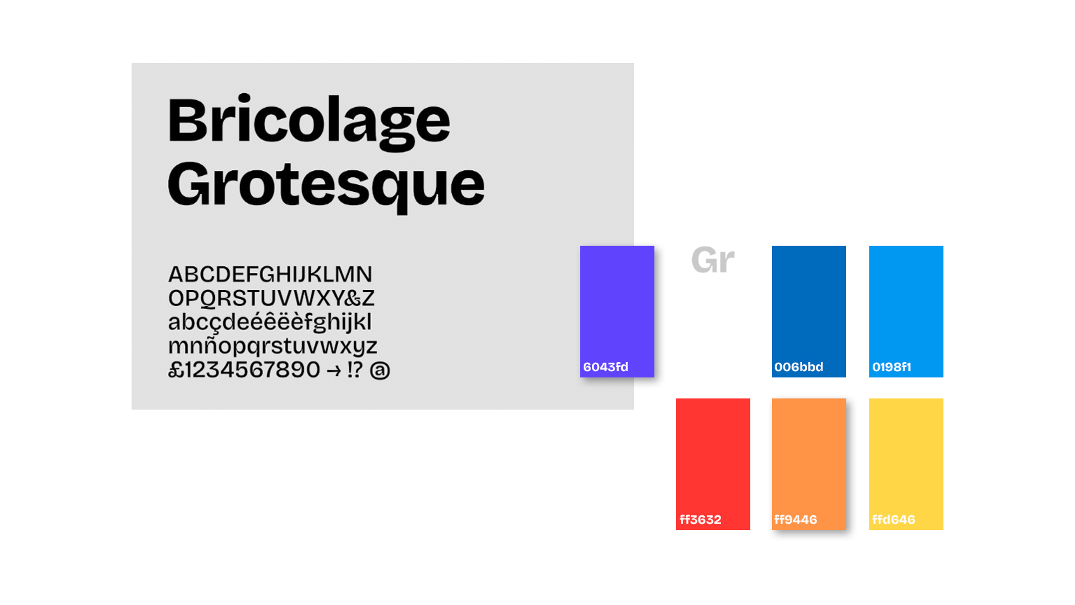
Colors
The chosen palette for Linkroo blends deep violet and electric blue, creating a dynamic yet trustworthy visual experience. Shades like bold purple and cool azure inject vibrancy and momentum into the brand, while accents of bright red and sunny yellow-orange bring warmth and attention to CTAs. Together, these colors convey a sense of innovation, clarity, and bold personal expression, a perfect match for creators building in public. This color strategy helps Linkroo stand out in the crowded SaaS landscape, reinforcing its identity as a modern and user-first platform.
Typefaces
We selected Bricolage Grotesque to reflect Linkroo’s blend of modern precision and creator personality. This typeface balances structure with subtle playfulness, offering clean letterforms that are both bold and legible across digital platforms. It aligns with Linkroo’s mission to simplify and empower, whether used in headlines, post templates, or dashboards. The generous spacing and contemporary feel enhance readability while reinforcing the brand’s confident tone, making it ideal for a product that turns ideas into high-performing LinkedIn content.
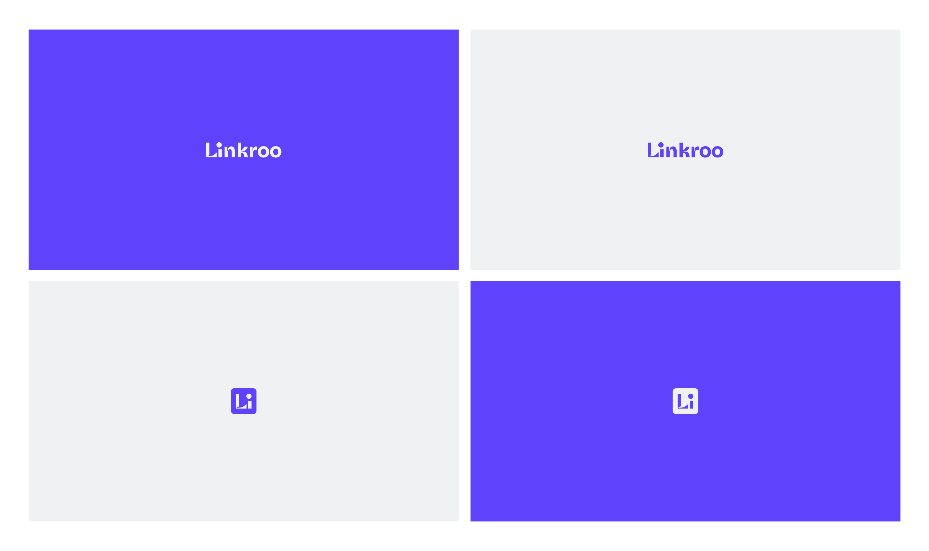
Logo
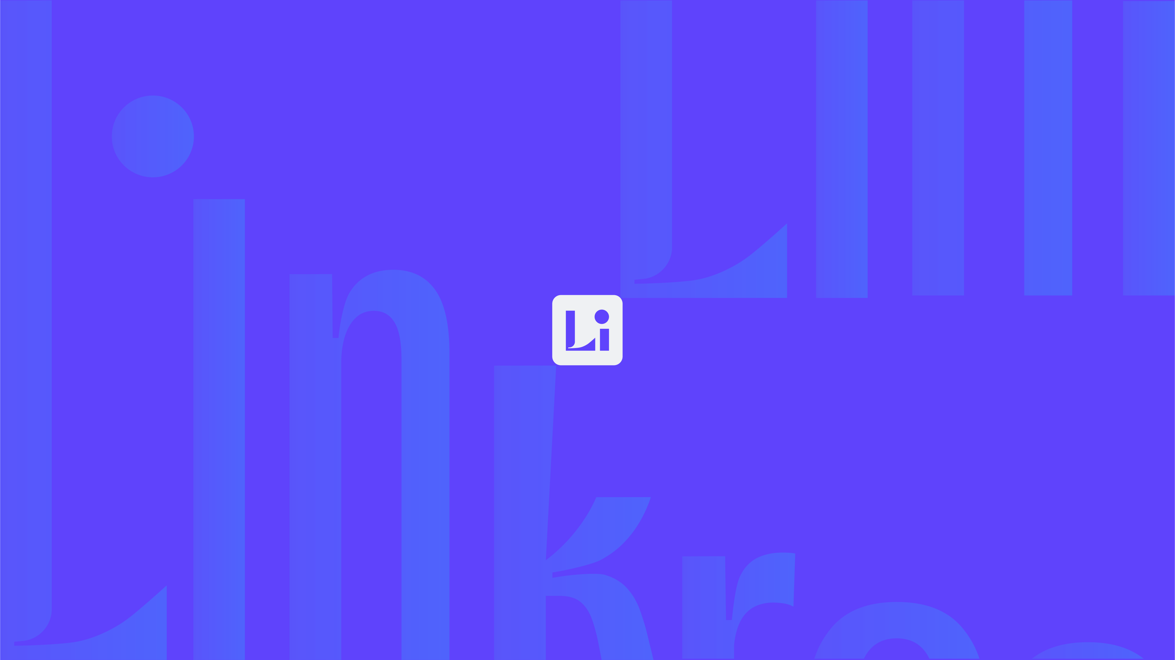
The Linkroo logo was designed with clarity and adaptability at its core. We intentionally chose a custom wordmark to ensure instant recognition and readability across a wide range of touchpoints. Given that Linkroo serves a diverse audience, including solopreneurs, content creators, and professionals at different tech comfort levels, we needed an identity that was both simple and universally approachable.The logotype features clean, geometric forms with carefully adjusted kerning to enhance visual balance and readability. The wide, even spacing creates a sense of openness, while subtle adjustments to the letterforms make the brand feel personal and human. We also developed a compact “Li” icon, abstractly representing a person at a desk, serving as a symbolic nod to Linkroo’s mission of supporting daily creation and consistent showing-up online. Together, this logo system delivers flexibility, friendliness, and trust, perfectly aligned with a SaaS product designed to work in the background while users take the spotlight.
website
The Maryam Beauty website is designed for simplicity and effectiveness, offering ample information to attract and inform potential clients. By showcasing previous work, it grants clients insight into the business's service quality, fostering trust and credibility. This feature also provides a comprehensive view of the services available.
Ease of access to the booking page facilitates convenient appointment scheduling, a pivotal element that bolsters the website's conversion rate. Optimized for diverse devices, the site caters to users accessing it via smartphones or tablets, recognizing the prevalence of mobile internet browsing. Its user-friendly interface and easy navigation ensure swift access to desired information, enhancing overall user experience.

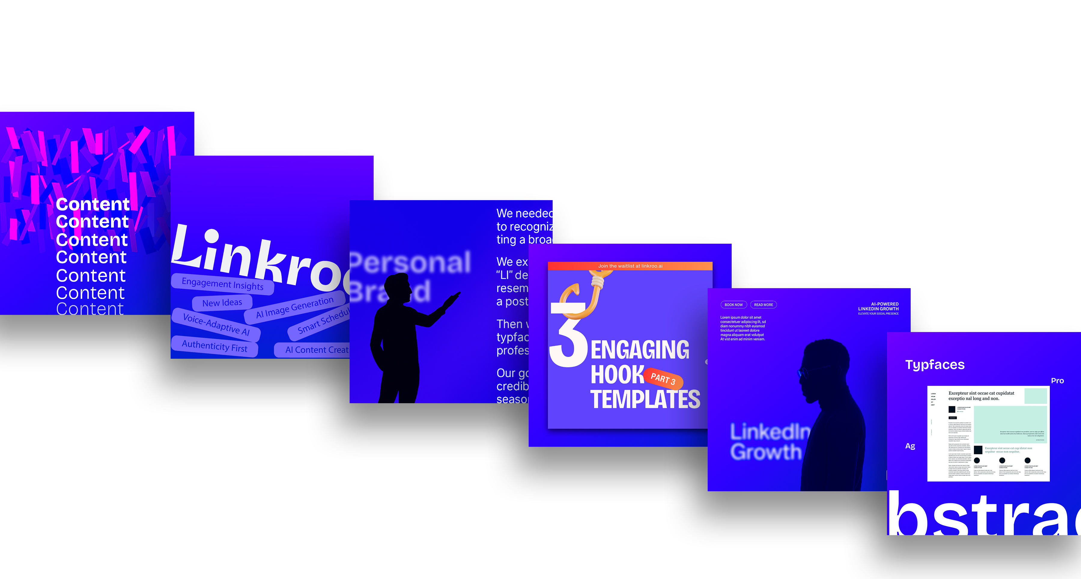
Mockups
For Linkroo, mockups played a critical role in validating the logo and color system across key digital environments. We tested the identity on app icons, website headers, social media avatars, and UI screens to ensure it maintained clarity, legibility, and brand recognition at various scales. Given the platform’s digital-first nature, it was essential that the logo adapted seamlessly to both light and dark modes, mobile responsiveness, and content-heavy interfaces. These mockups allowed us to refine contrast, spacing, and visual hierarchy, ensuring the brand remained consistent, accessible, and professional across every user touchpoint.