Date
Aug 2024 to Oct 2024
Brand Overview
Moss Hachey Law, founded by Erika Hachey and Andrew Moss, specializes in personal injury claims, guiding clients through the complexities of insurance and legal disputes. Drawing on their backgrounds in insurance defense, the firm is dedicated exclusively to advocating for individuals pursuing fair compensation. Based in Fredericton, NB, Moss Hachey Law is committed to accessibility, client-centered pricing, and innovative practices that simplify the legal process.
Task Requirement
Moss Hachey Law needed a high-quality website to effectively showcase their strengths and services. As a personal injury law firm, they must communicate their expertise and commitment to client advocacy clearly and professionally. A well-designed website helps build trust with visitors by providing a polished, accessible representation of the firm’s values and capabilities.
In addition, ease of connection is crucial for potential clients who may need support during challenging times. The website’s user-friendly design makes it simple for visitors to reach out, whether to ask questions or schedule a consultation. Ensuring the site is fully responsive was also essential, as clients use a variety of devices to browse and connect online. By having a responsive, professional website, Moss Hachey Law can engage more effectively with their audience, reinforcing their reputation and making it easy for clients to find the help they need.
Target Audiences
Moss Hachey Law targets individuals dealing with a range of personal and legal challenges. Their focus includes:
Injury-Related Claims: Such as motor vehicle accidents, slip and fall injuries, and animal attacks, targeting individuals seeking compensation for physical injuries and related losses.
Disability and Health-Related Issues: They cover disability benefits and CPP (Canada Pension Plan) disability claims, which indicates a focus on helping those with long-term health challenges secure financial support.
Professional Misconduct and Negligence: Professional negligence and defamation cases suggest they represent clients impacted by the improper actions of professionals or reputational harm.
Sensitive Personal Cases: Sexual assault or harassment cases indicate they offer support to individuals facing deeply personal and traumatic experiences, requiring specialized legal representation.
Legal and Financial Planning: By handling wills, powers of attorney, and product liability cases, they also cater to those seeking guidance on estate planning and consumer rights.Overall, Moss Hachey Law targets clients facing personal, health, and financial challenges, often during vulnerable times, requiring both legal expertise and compassionate support.
Visuals Elements
We crafted a cohesive brand identity with design elements that balance professionalism and approachability. Clean imagery and carefully chosen fonts convey accessibility and trust, reinforcing the firm’s modern, reliable image to attract clients seeking legal support.
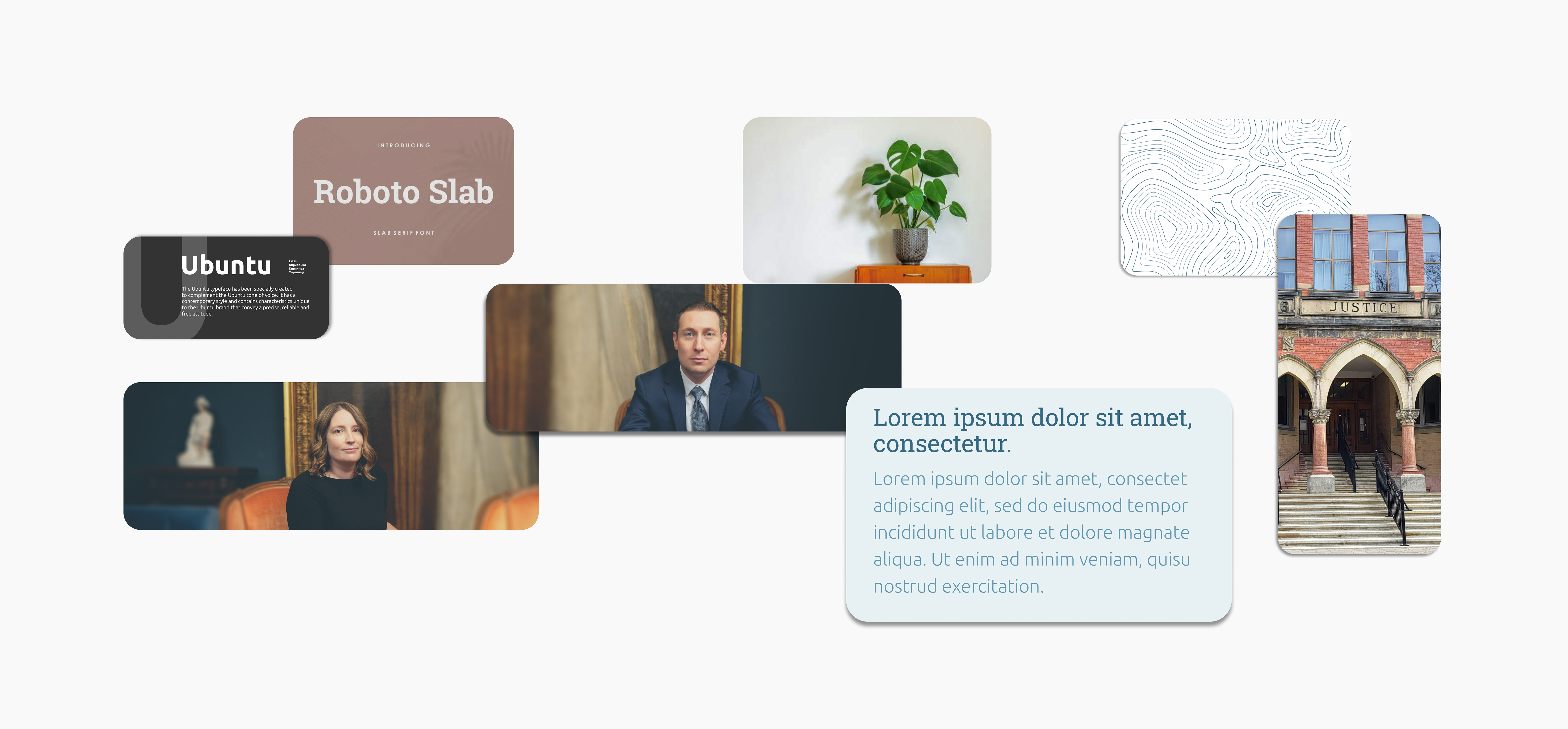
Clean Images: The use of clear, straightforward images helps create a welcoming and trustworthy impression, allowing potential clients to connect with the firm’s approachable and reliable nature. Images of people, places, and relatable objects help humanize the brand, making it feel warm and accessible.
Typefaces: A sense of structure and authority, suitable for a law firm, is conveyed through the use of Roboto Slab, a slab serif typeface. It adds a subtle hint of formality without feeling overly traditional, supporting the firm’s modern, client-focused approach. Ubuntu is a friendly, open sans-serif typeface that maintains readability across different screen sizes. Its contemporary design complements Roboto Slab, adding balance by offering a softer, more approachable touch. Together, these typefaces create a blend of professionalism and accessibility, ideal for a law firm looking to connect with a diverse audience.
Colors
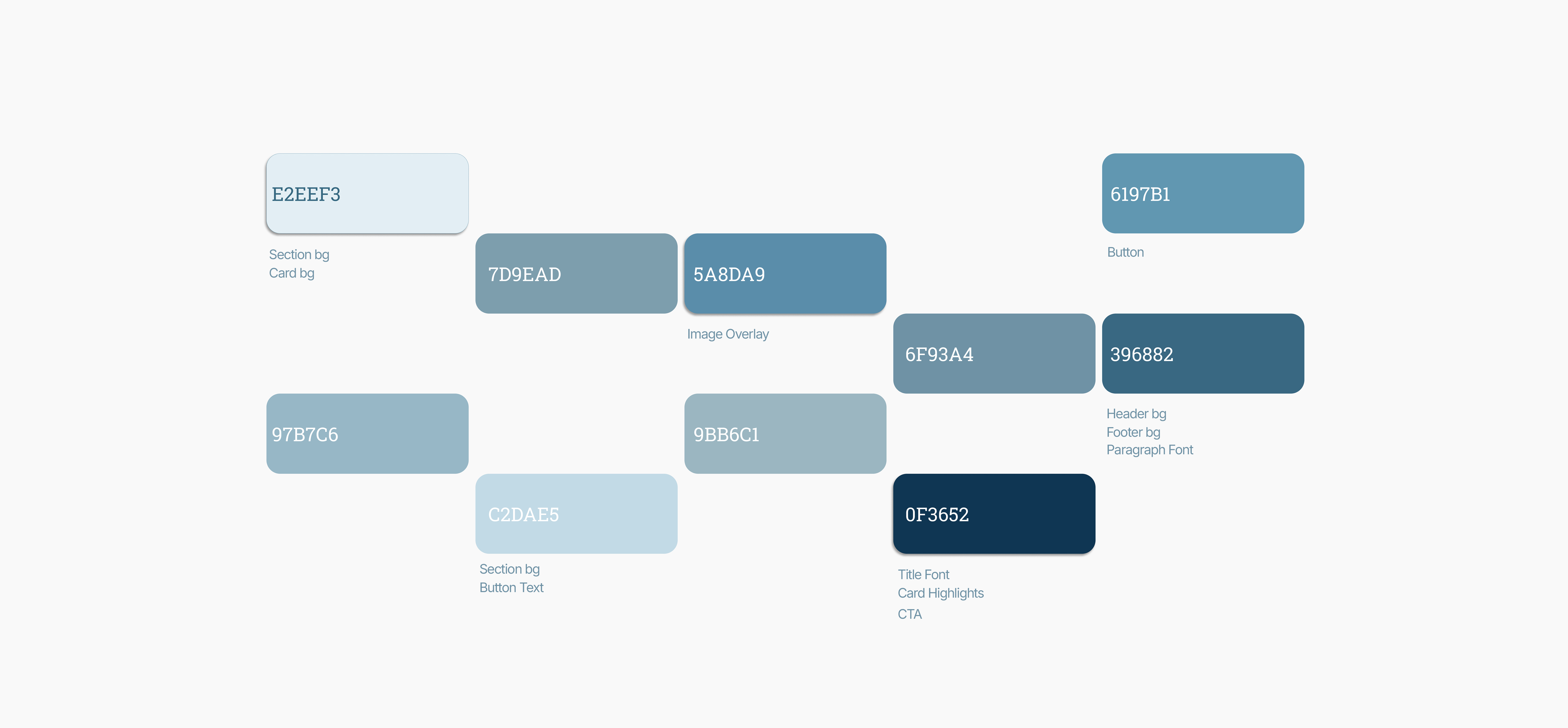
The client preferred shades of blue for their brand, so we expanded the color palette to reinforce a sense of calm, trust, and authority, qualities vital in the legal industry. As shown in the image, this palette incorporates a range of blues, from lighter, soothing tones to deeper, authoritative hues, creating a balanced visual experience. These colors not only enhance the website’s aesthetic but also evoke the professionalism and reliability clients expect from a law firm.
Map
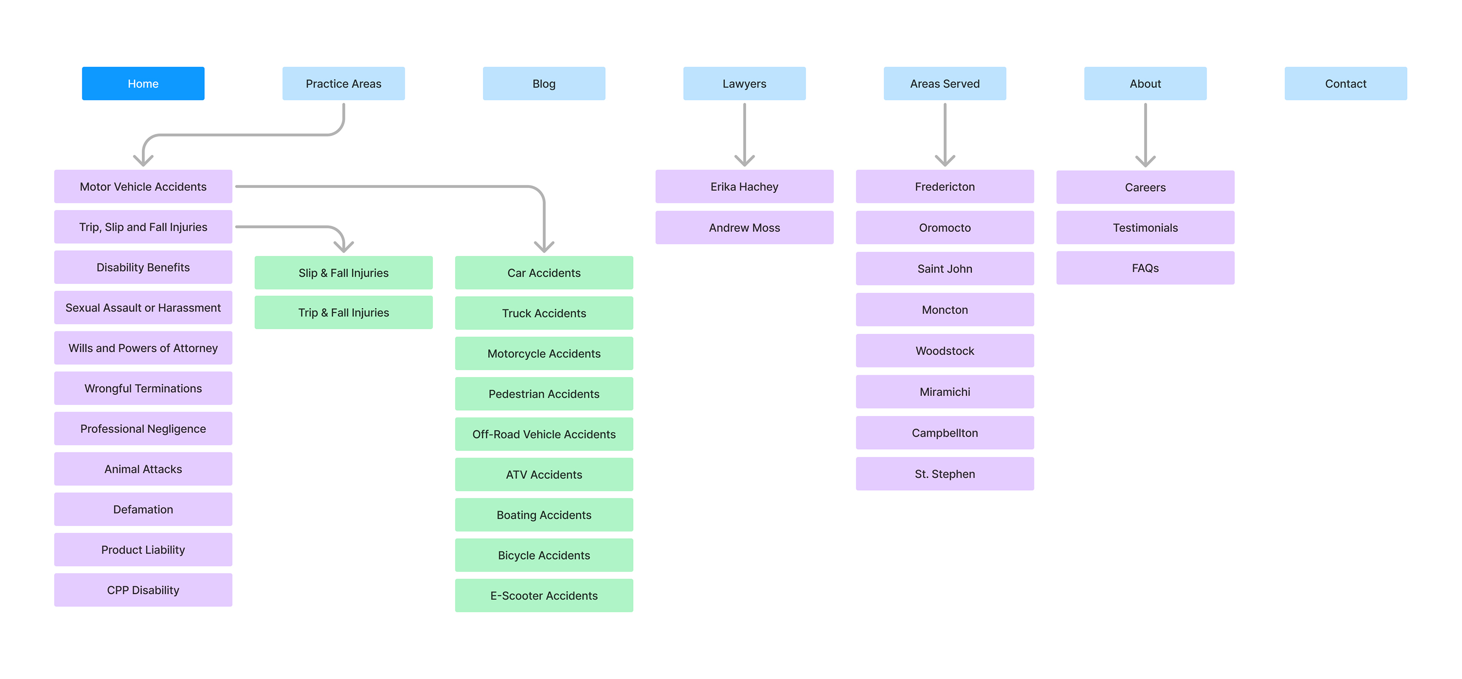
This sitemap outlines the structure of the Moss Hachey Law website, organizing key pages and subcategories for easy navigation.
Home is the main entry point. Practice Areas details specific legal services, including motor vehicle accidents, disability benefits, and professional negligence, with further subcategories for more specific cases. Blog covers articles related to various types of accidents and injuries. Lawyers introduces Erika Hachey and Andrew Moss. Areas Served lists locations where services are offered, such as Fredericton and Moncton. About includes information on careers, testimonials, and FAQs. Contact provides ways for clients to reach the firm. This structure allows users to easily locate relevant legal services, information about the firm, and contact options.
Visit Website
Desktop
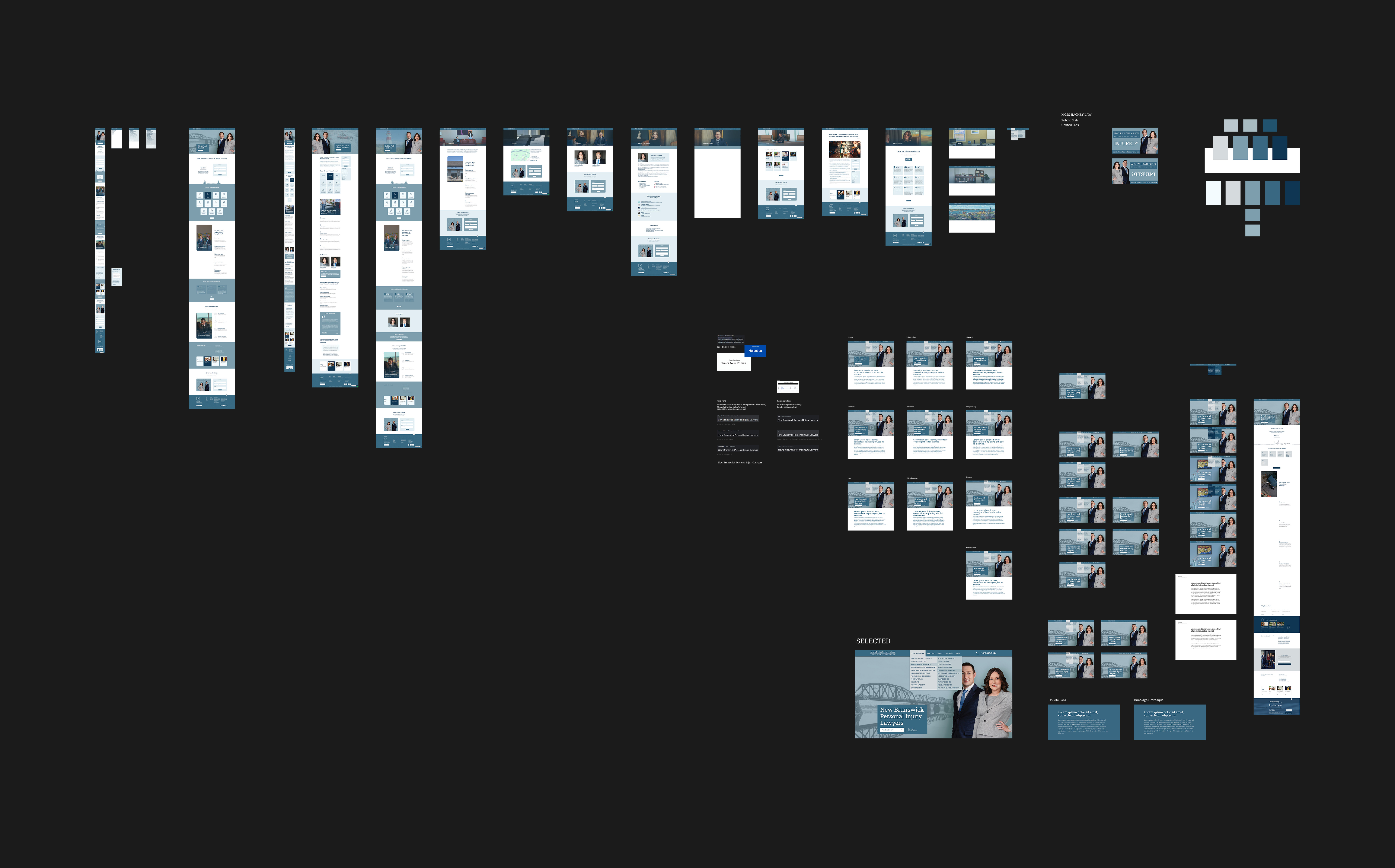
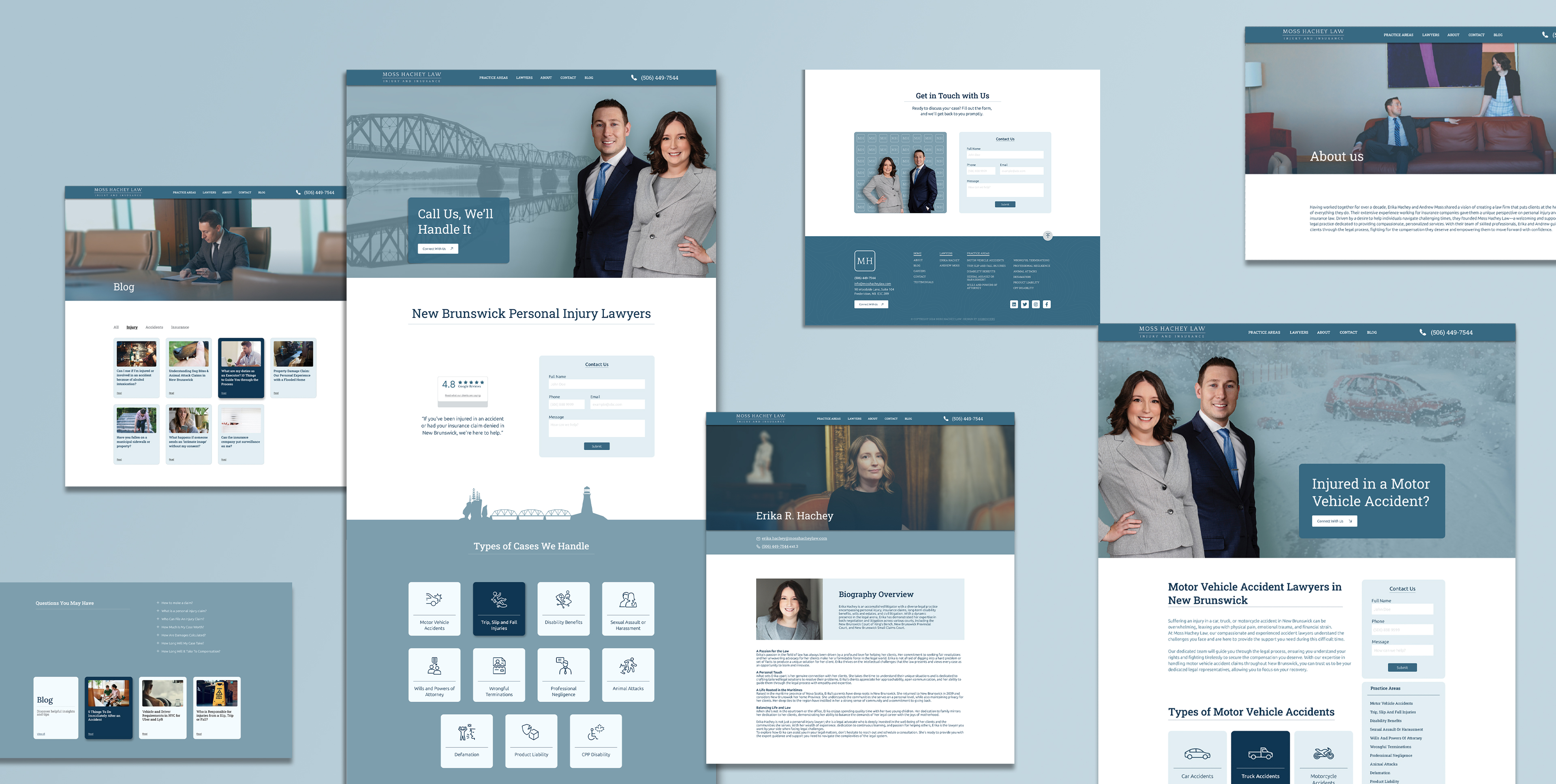
The Moss Hachey Law website features a clean, spacious layout with well-organized content blocks, generous white space, and a modern interface that enhances readability and visual appeal. Icons, cards, buttons, and illustrations streamline navigation and establish a clear visual hierarchy, while thoughtful typography and consistent fonts ensure brand cohesion and readability. Team photos and balanced imagery add warmth, fostering engagement and creating a professional, approachable experience that aligns with the standards of a legal services website.
Mobile
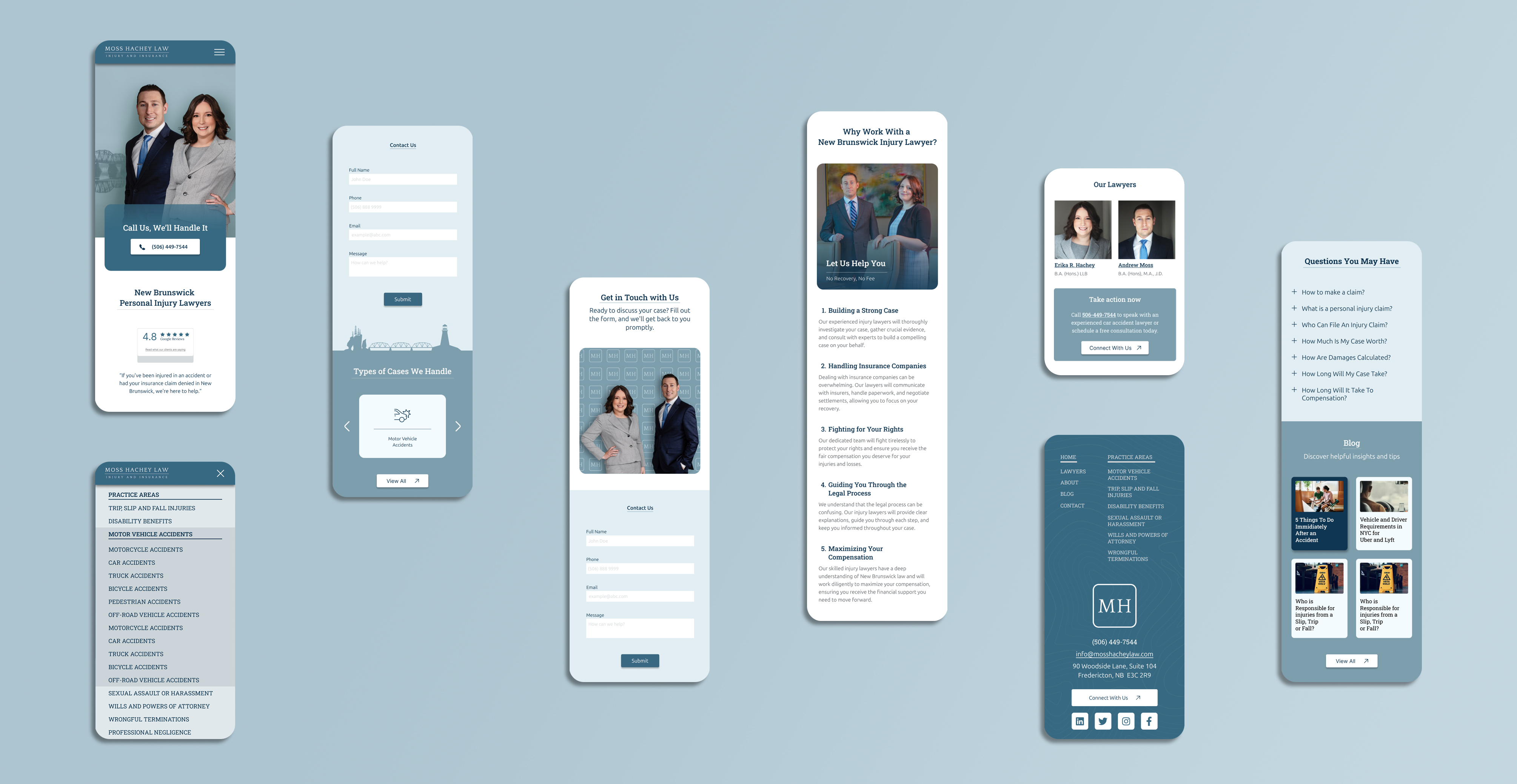
In the mobile design for Moss Hachey Law's website, buttons, icons, and cards are thoughtfully arranged to ensure smooth navigation, making it easy for users to find and access information quickly. The typography is optimized for readability, with fonts and sizes chosen to maintain clarity on smaller screens. Responsive layouts adapt the design elements seamlessly, preserving usability across various devices.
Visuals are carefully scaled, with balanced sizing and spacing to keep everything functional and visible on mobile displays. This approach creates a clean and organized look without overwhelming the user. Analytics confirmed that most visitors access the site via mobile, emphasizing the importance of a mobile-first experience that is optimized for both functionality and aesthetics.
To summarize, the new website is designed to strengthen MHL’s online presence, showcasing their expertise and professionalism while making it easy for clients to connect. The site uses a clean, spacious layout with well-organized content, ensuring a seamless user experience. Thoughtful design elements—such as buttons, icons, and cards—enhance navigation, and responsive layouts make it accessible across devices. With an optimized mobile-first design, the site caters to the majority of visitors who access it via mobile. The website’s clear, professional presentation and improved functionality aim to increase engagement, build client trust, and support business growth by attracting and converting new clients more effectively.
Visit the case study on DigiBenders